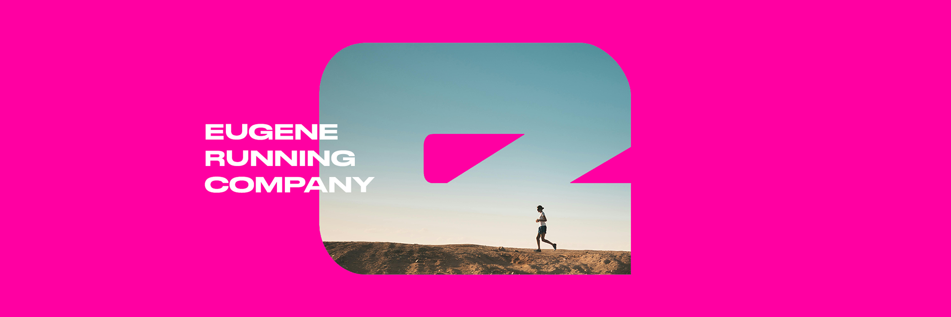
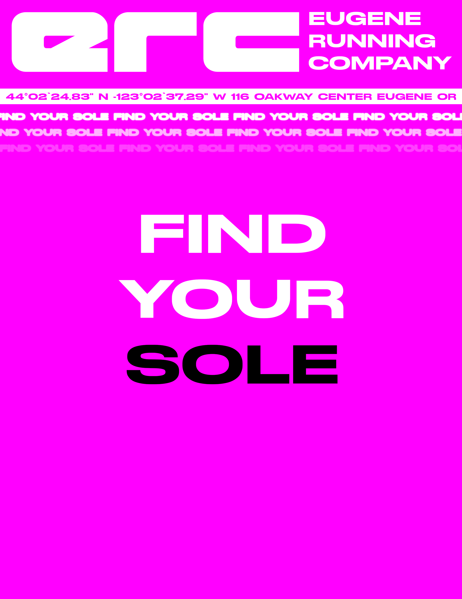
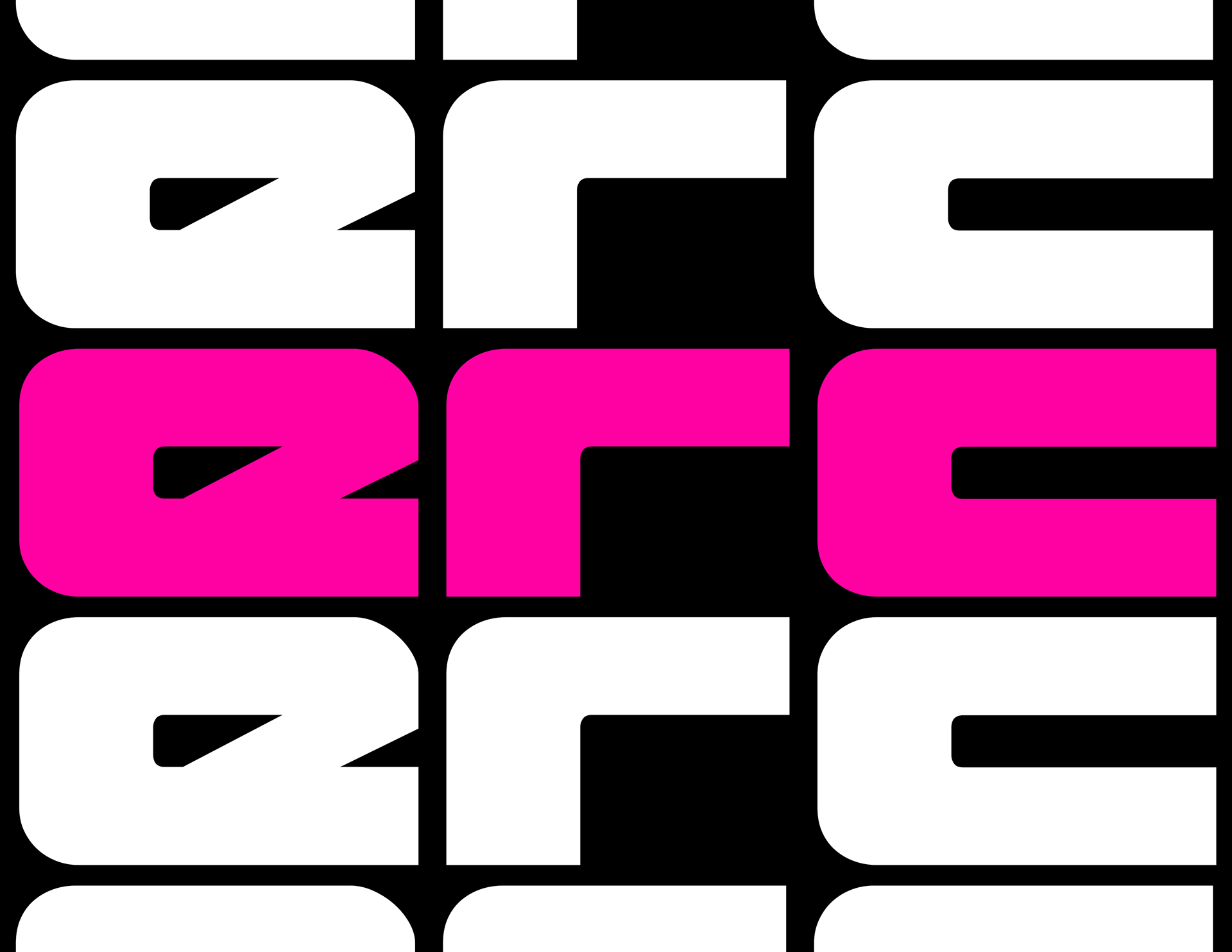
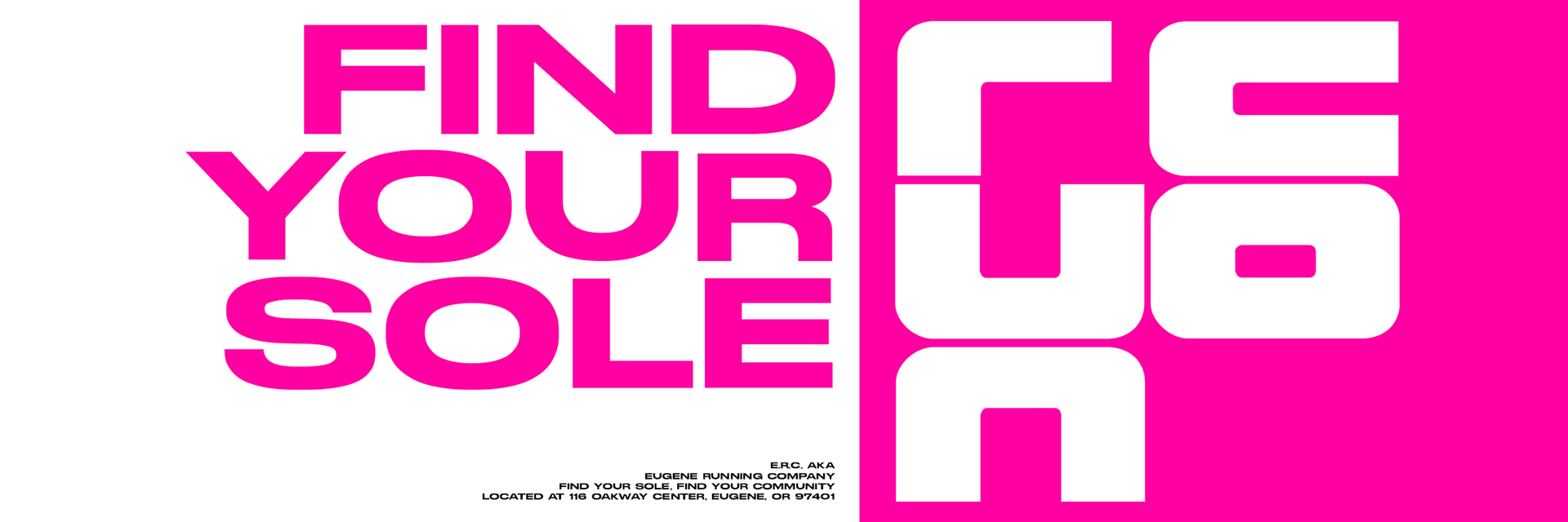
Alright. Let's be honest here, Eugene Running Company was due for a rebrand. I’m somewhat of a sucker for old overcomplicated iconography, but after much deliberation and pushing from my professor, I have fully hopped on the bandwagon of purging this beloved but slightly archaic branding from the face of the Earth. Modernize it! The masses chanted. The chorus of streamlining and simplicity gnawed at my mind until I eventually gave in. Not only did I give in, but I embraced it. Fully, enthusiastically, and even maniacally. You want modernism? I asked the feverish crowd. Putting my digital pen to my digital paper, I crafted something, a dreadful amalgamation of the future and the past, with sleek and simplistic visuals that gleamed in the overly-saturated sun and assaulting colors that not only captured your attention, but demanded that your eye be drawn to it. Gone were the subtle greens and waving trees that sprouted from the original vision of Bob and Lynda’s in the early 2000s. My slightly abstract and painfully hyper-futuristic rebrand forcefully takes over like a rocket going Mach five into the stratosphere of modernity. P.S. This was my first time printing and using print specifications, so the colors were screwed up somewhere in the process. I think I switched to CYMK and accidentally messed up the hues. The pink is supposed to be the color in the first image below. Ya live and ya learn.
ROUGH WEBSITE MOCKUP BELOW:
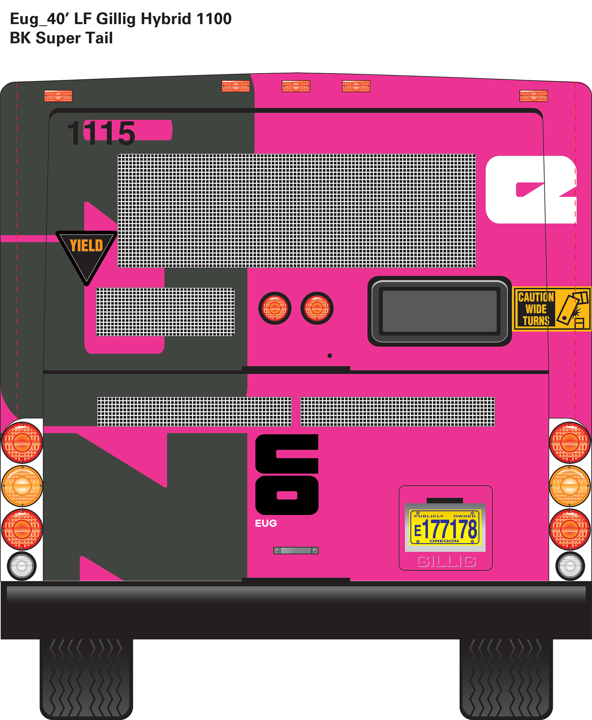
BUS DESIGN: